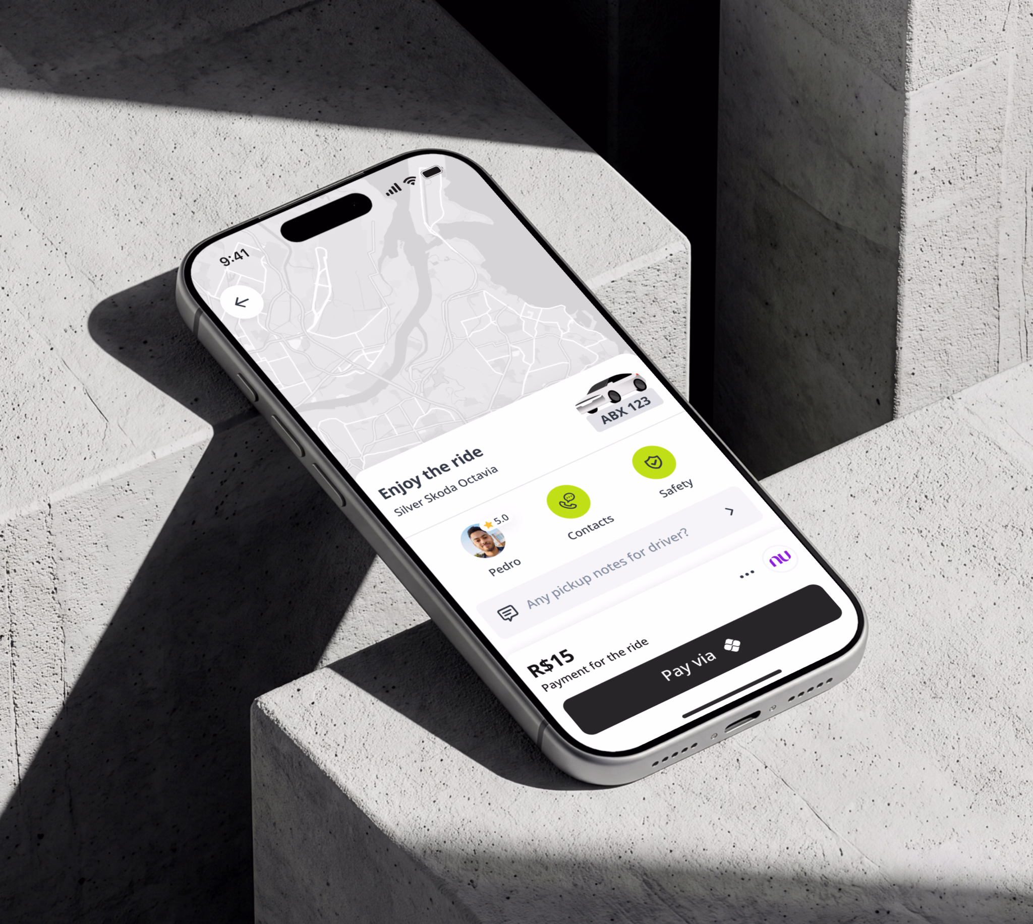
+11% rides per
user in Brazil
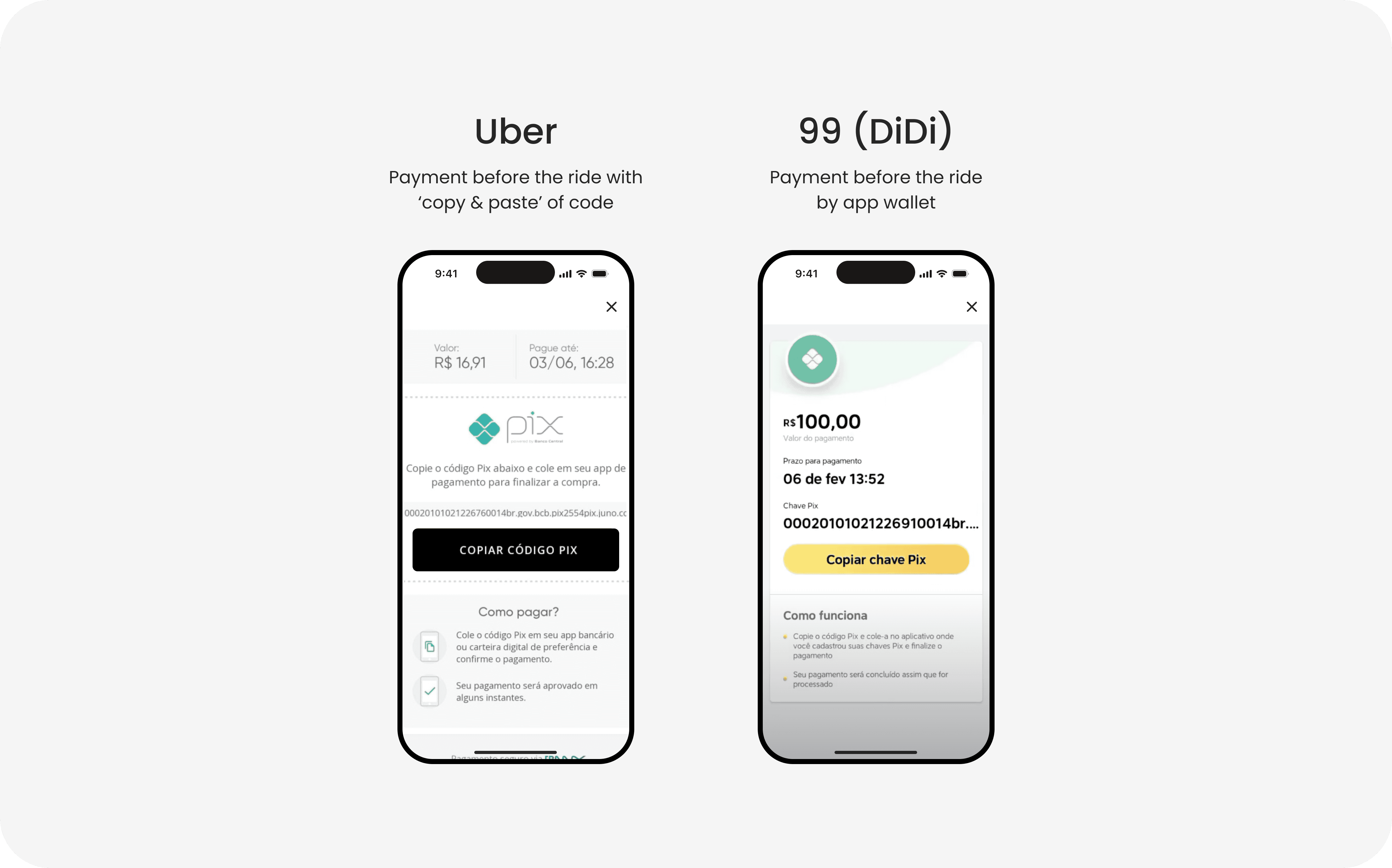
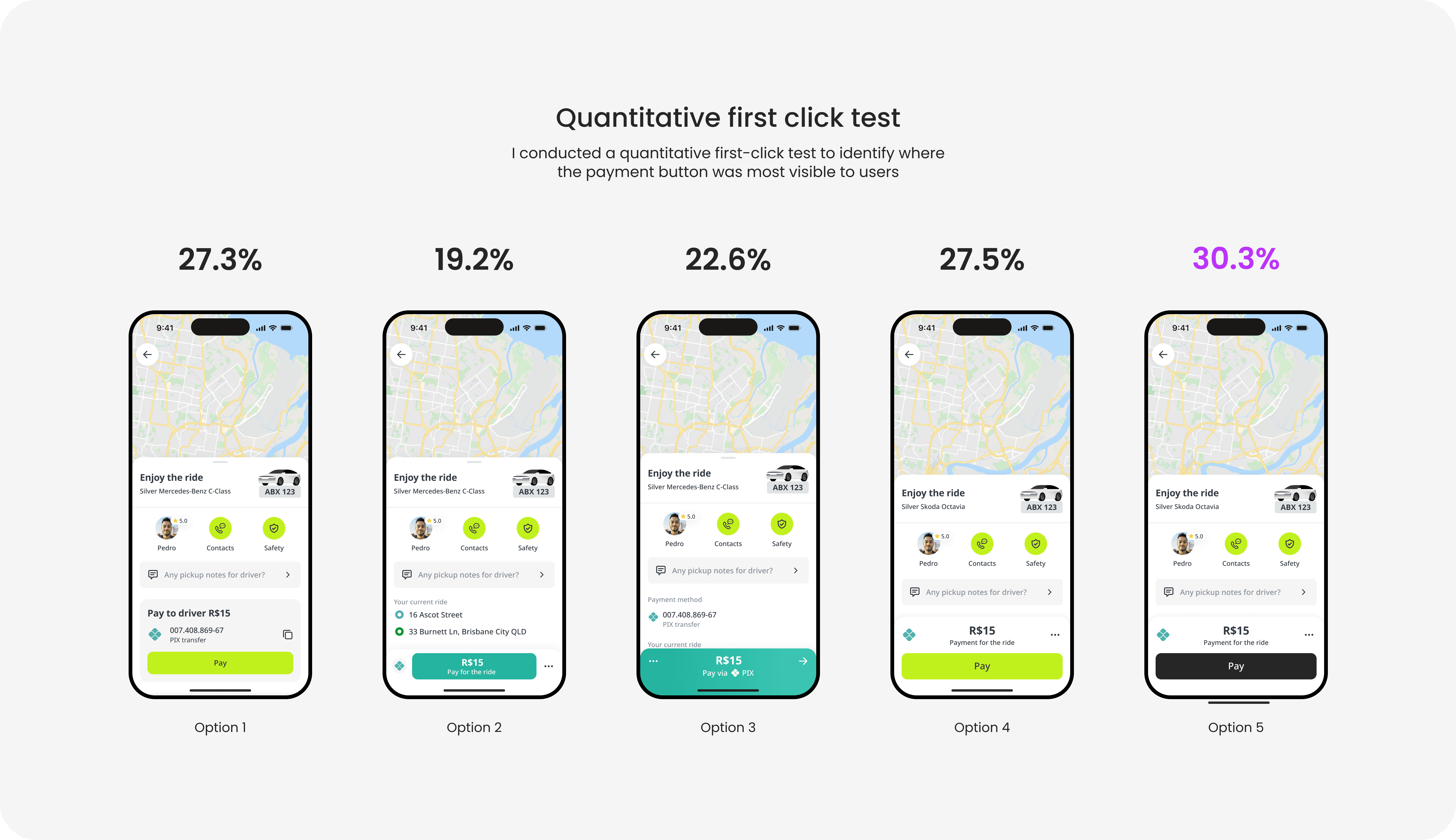
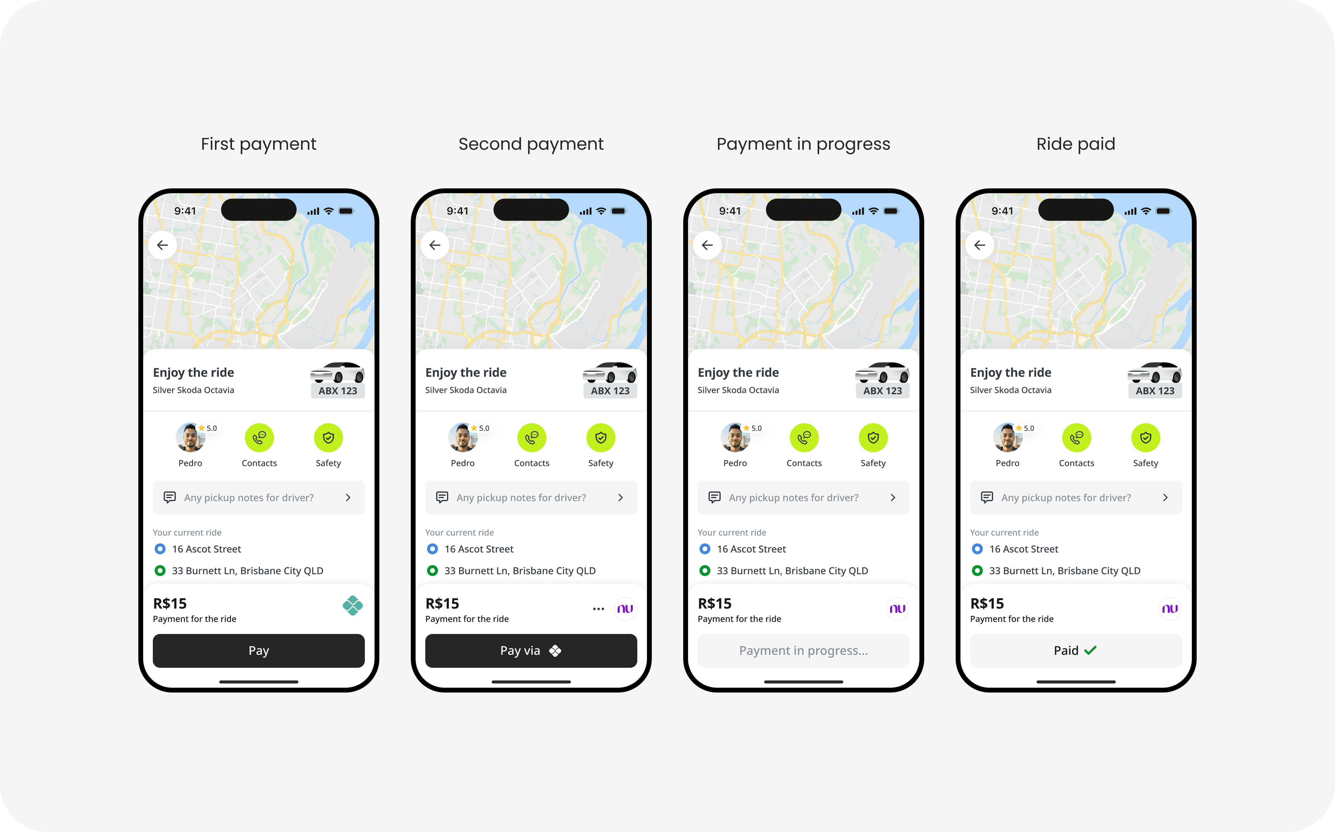
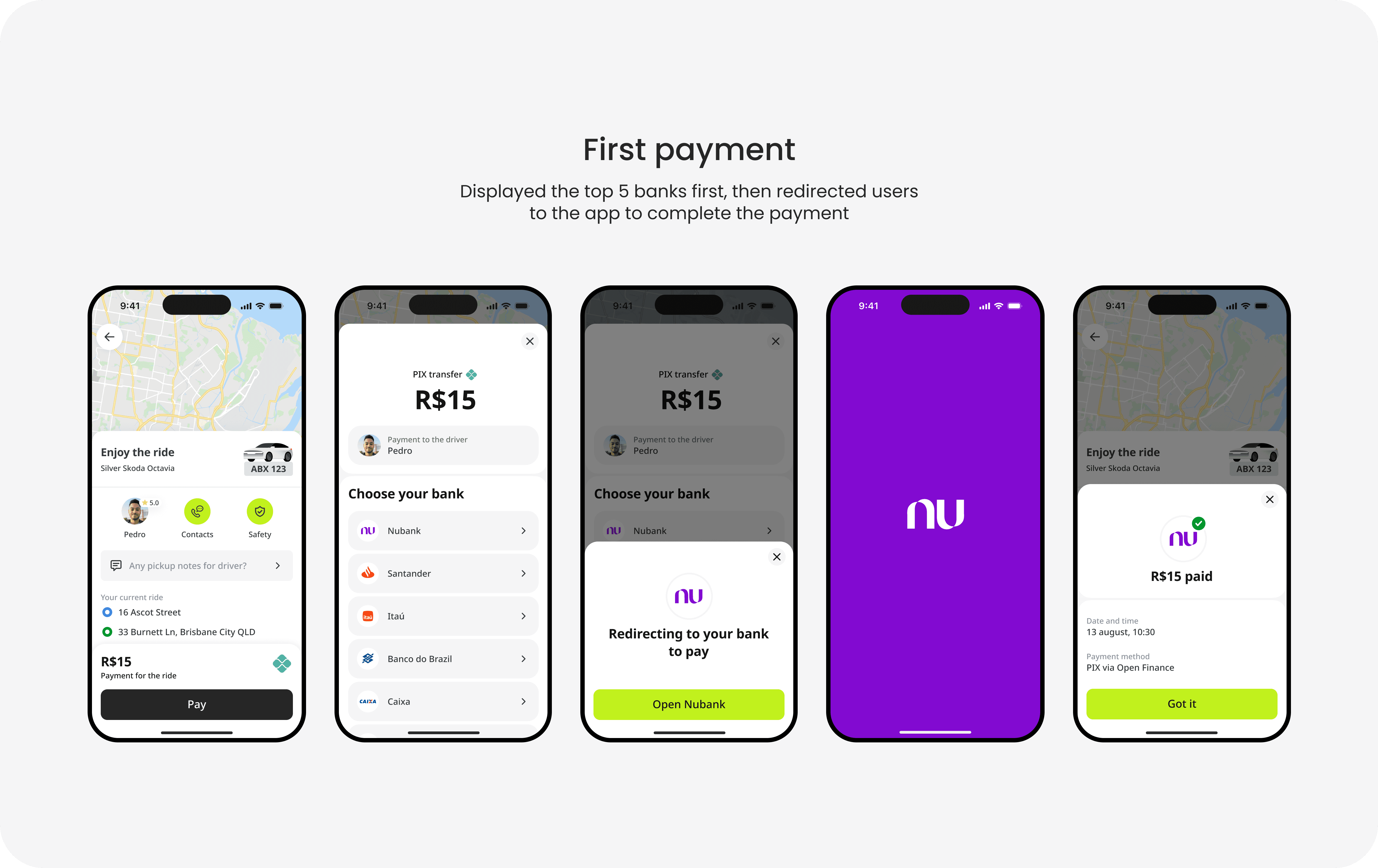
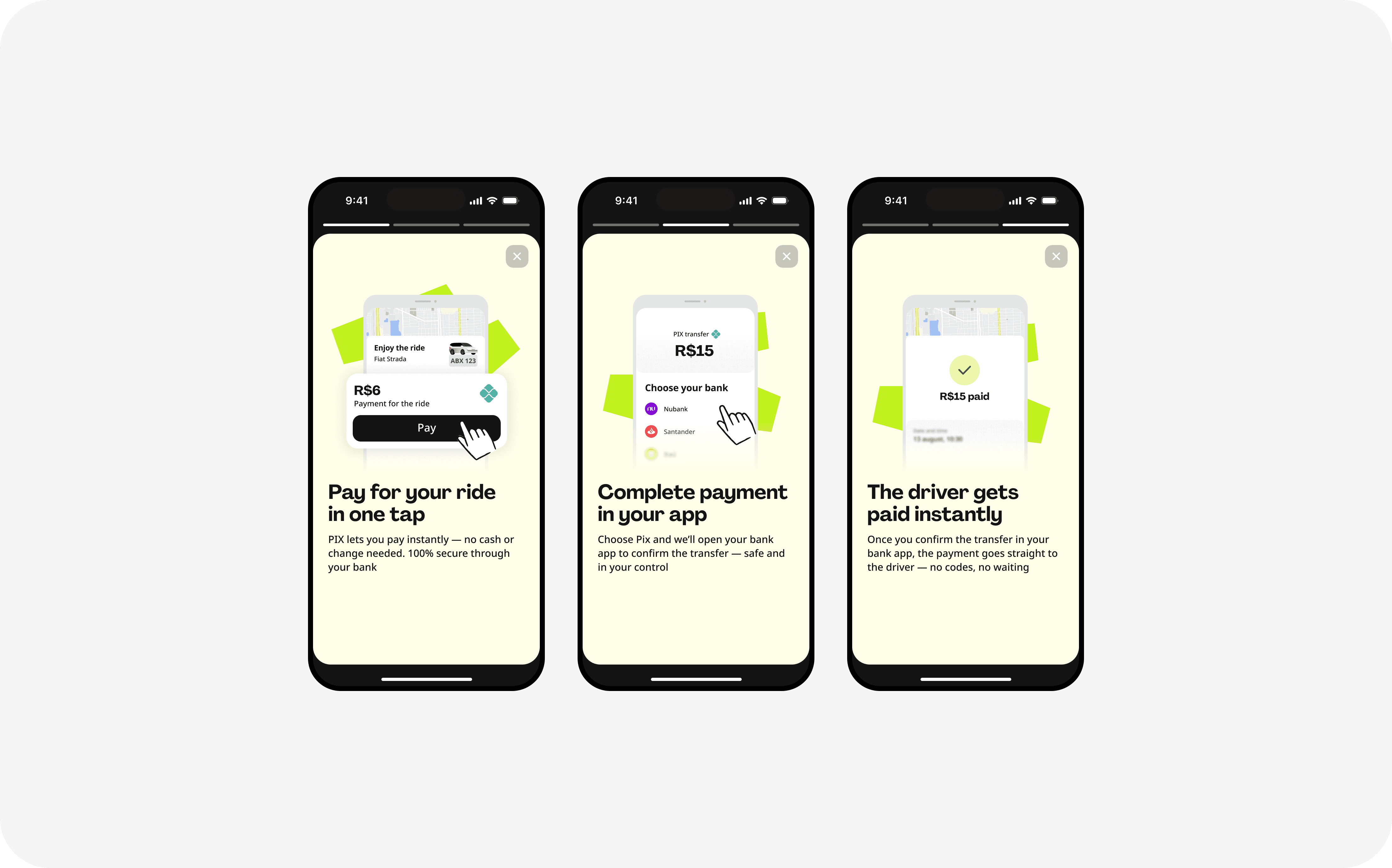
Driving cashless growth through PIX, Brazil's most popular payment method.
Systems, not screens. I design products wherea thousand small decisions read as one.
Driving cashless growth through PIX, Brazil's most popular payment method.

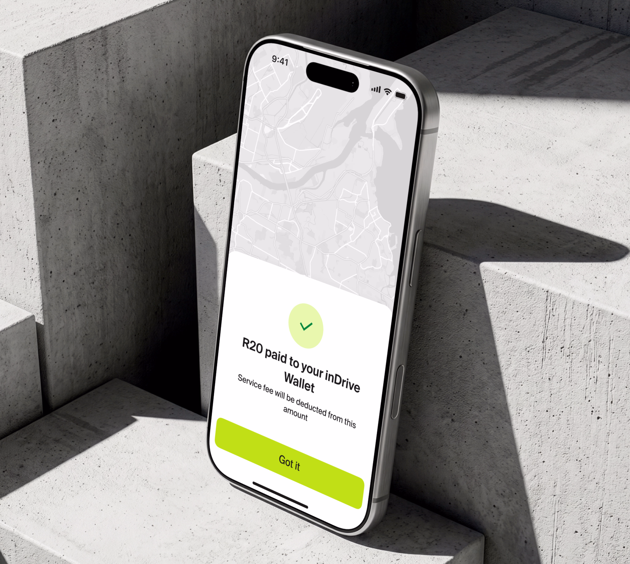
Launching cashless payments for drivers who got paid in cash.

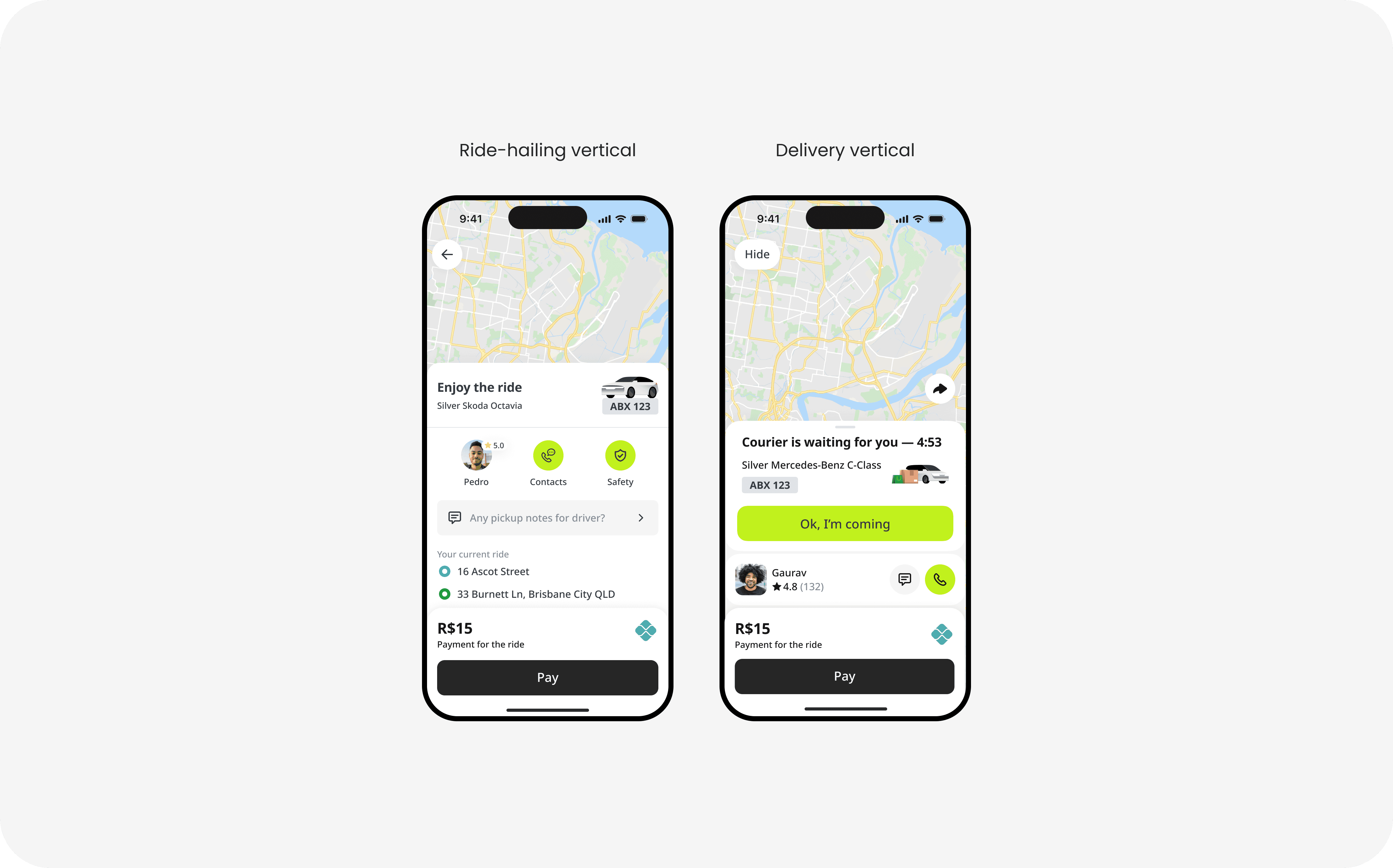
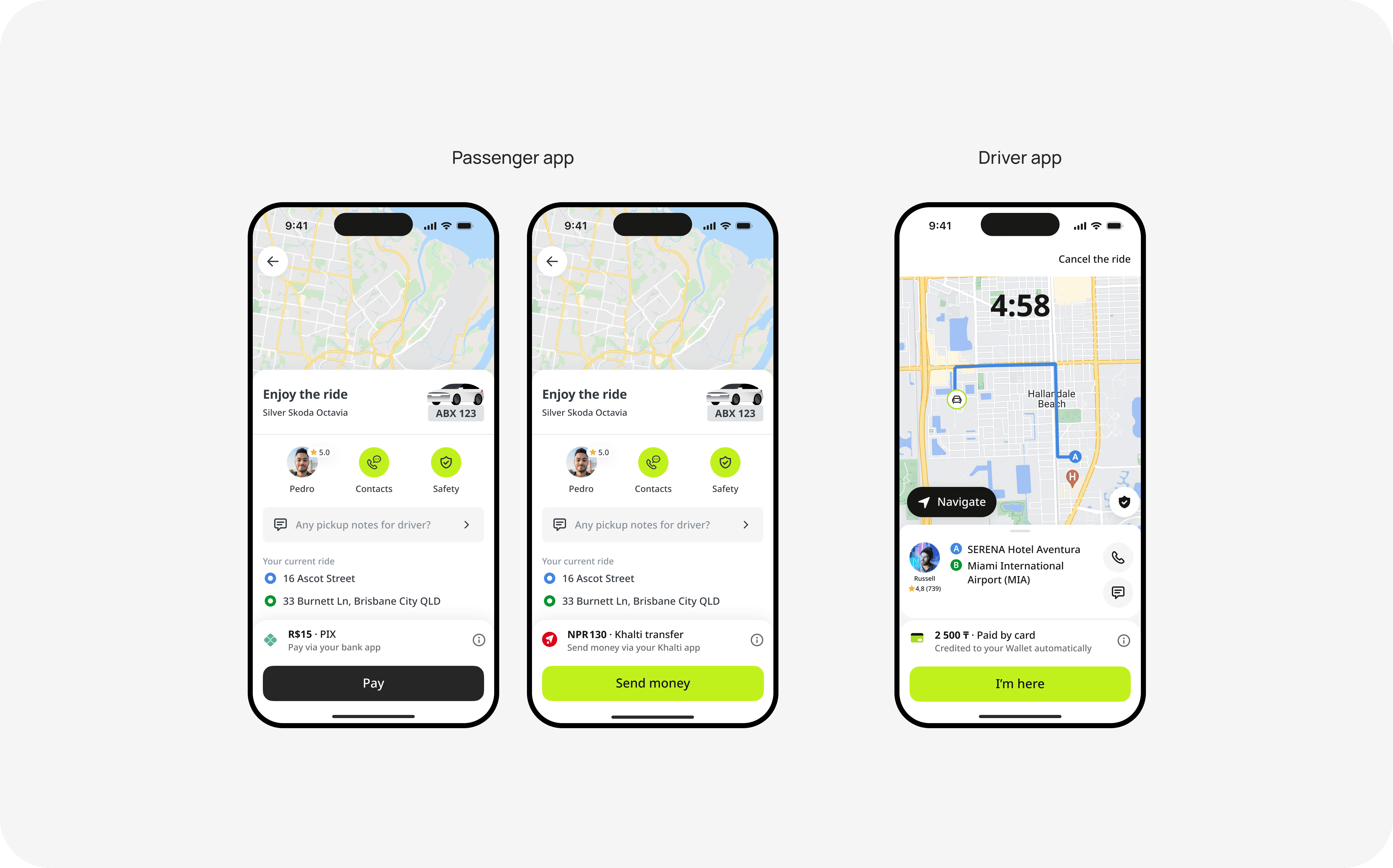
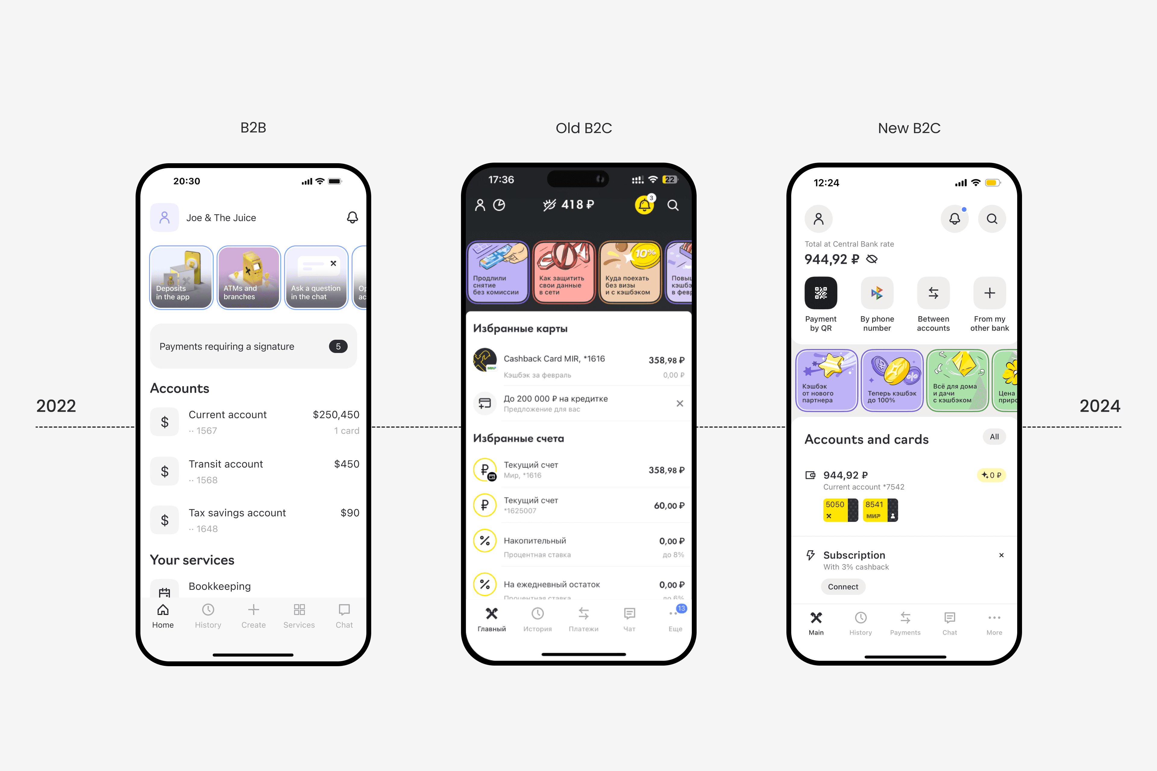
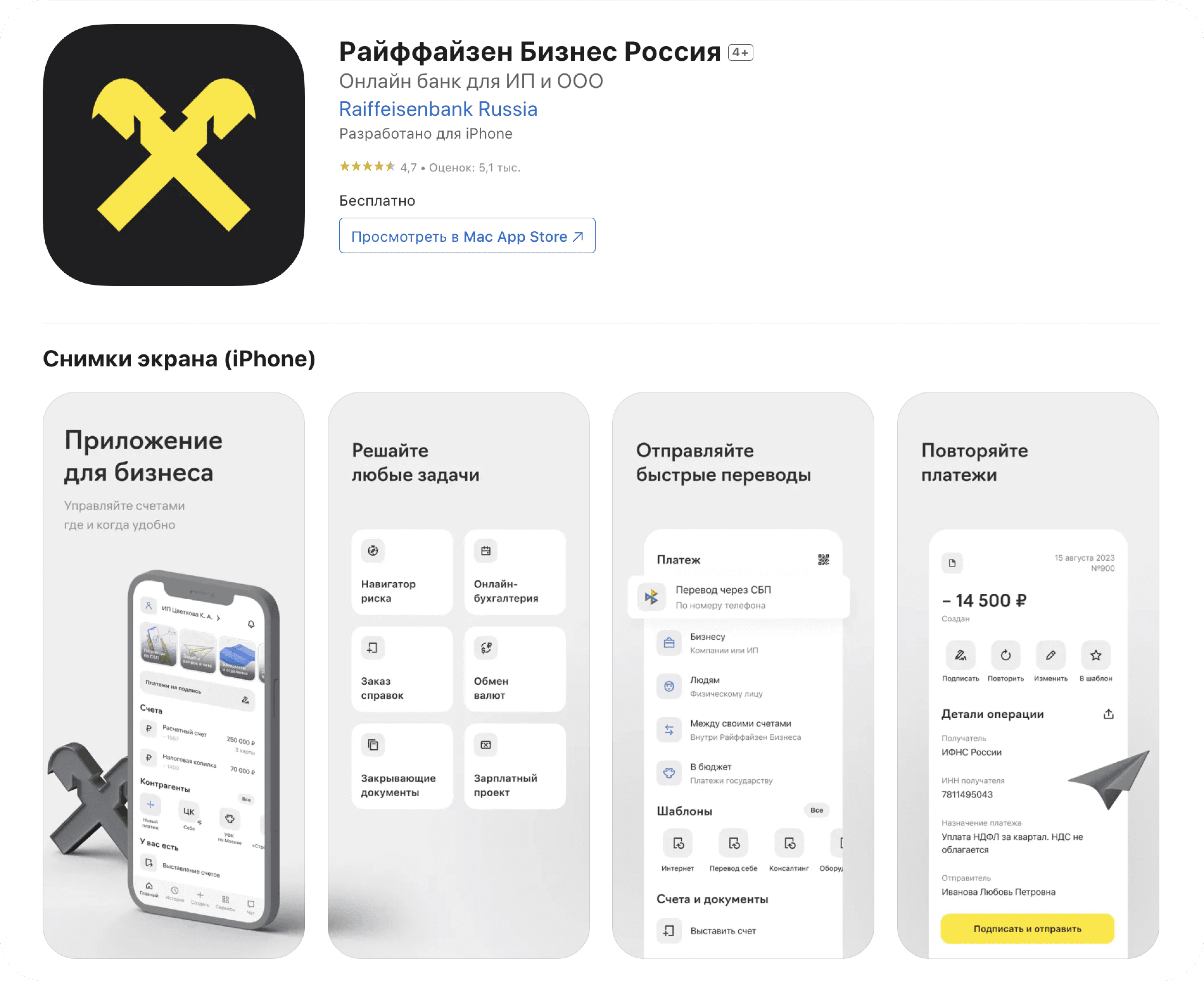
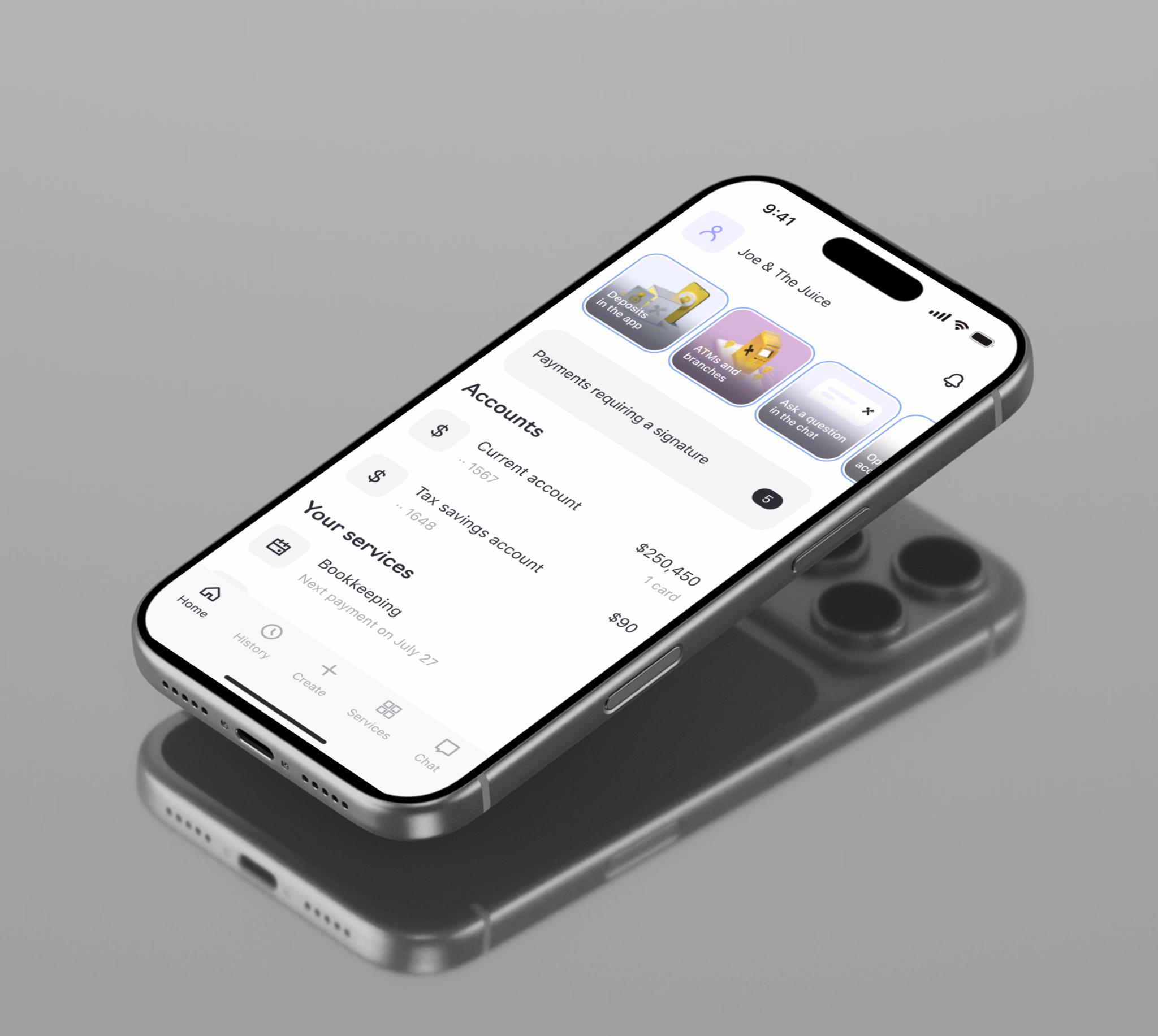
A new architecture to move web users to mobile and support future growth.
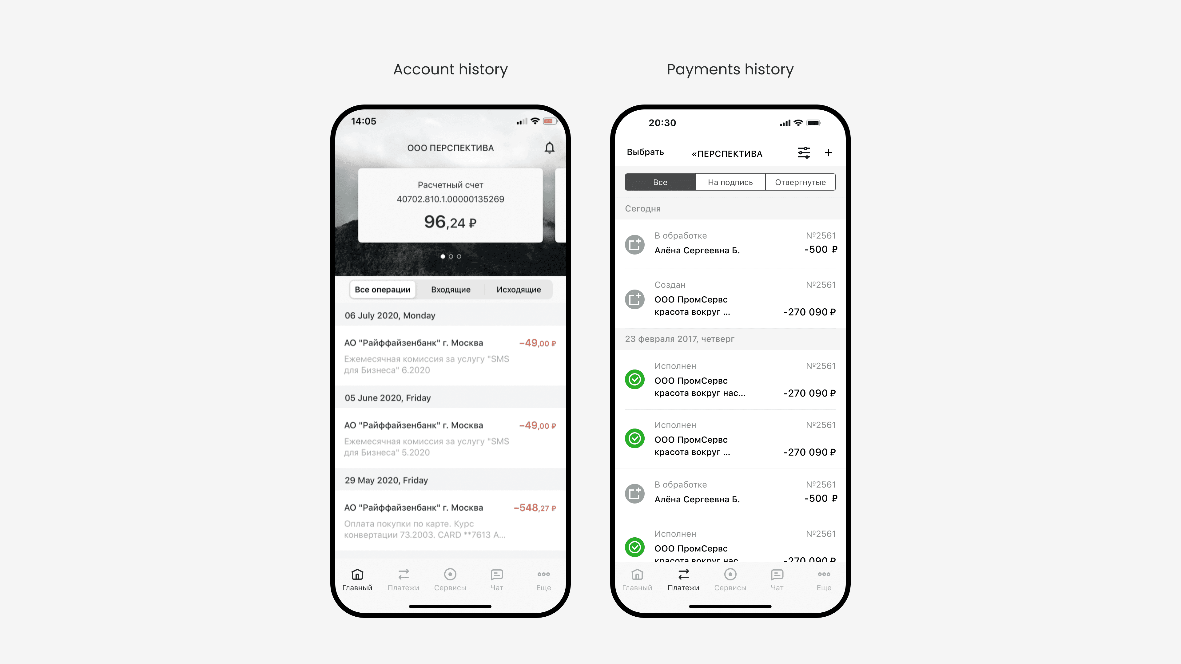
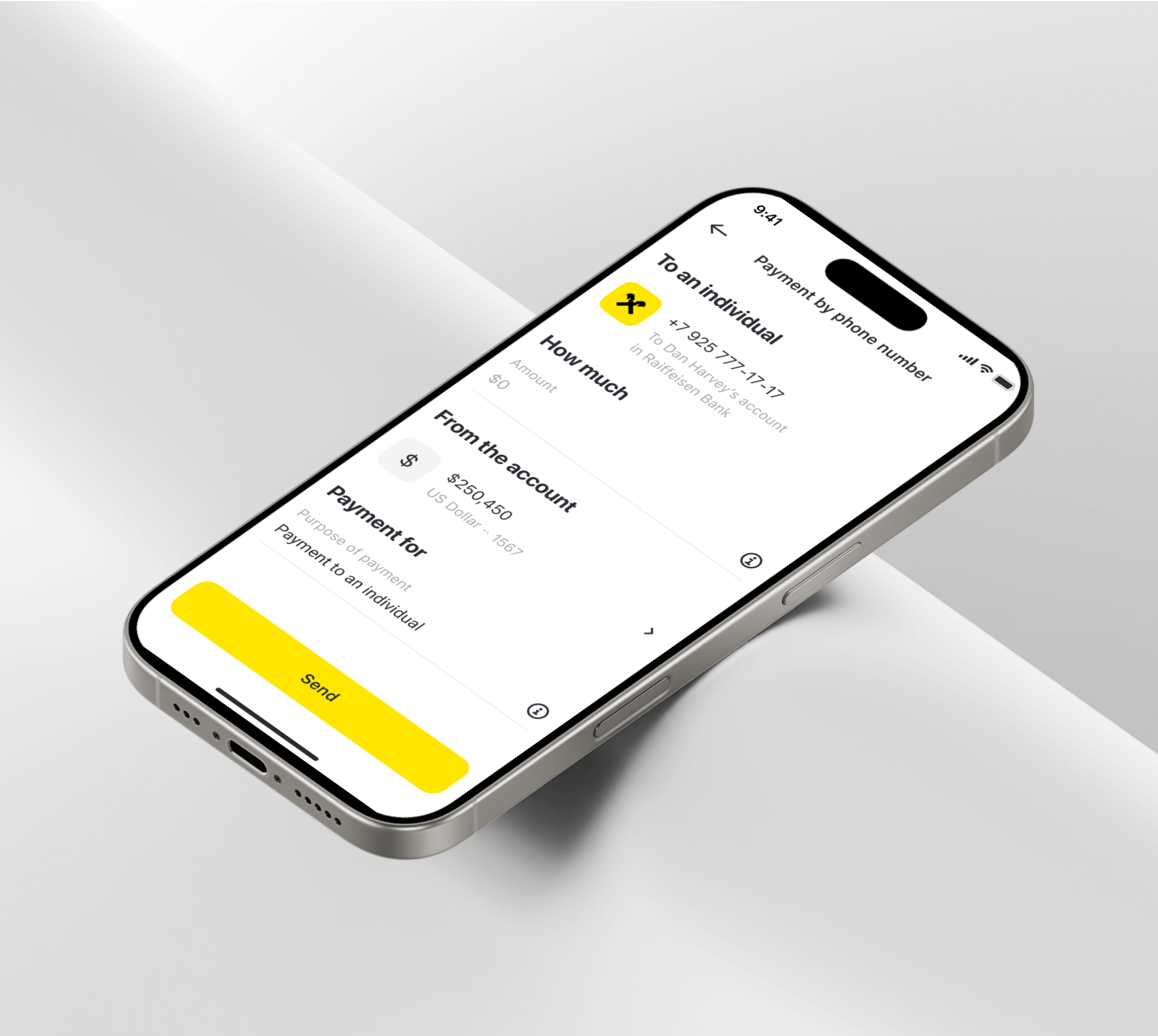
Replacing a three day wait with instant 24/7 transfers.

I have an academic art education with a specialization in environmental design, where I learned to see every detail as part of a larger system. That mindset still shapes how I design digital products today.
For the past 8+ years, I’ve worked across fintech, mobility, marketplaces, banking, and payments, turning complex business problems into simple, intuitive experiences.